Multilingual DTP Without the Squeeze: RTL/CJK Typography Essentials
Layouts break after translation when RTL and CJK rules aren’t respected. This 5-minute guide covers Arabic/Hebrew (RTL) and Chinese/Japanese/Korean (CJK) essentials, InDesign settings, font choices, and a two-minute preflight checklist.
Multilingual DTP Without the Squeeze: RTL/CJK Typography Essentials
Reading time: ~5 minutes
Great translation can still look “off” if the layout ignores script rules. The quickest wins in multilingual DTP come from two families: RTL (Arabic/Hebrew) and CJK (Chinese/Japanese/Korean). Here’s a compact field guide with practical settings you can apply today.
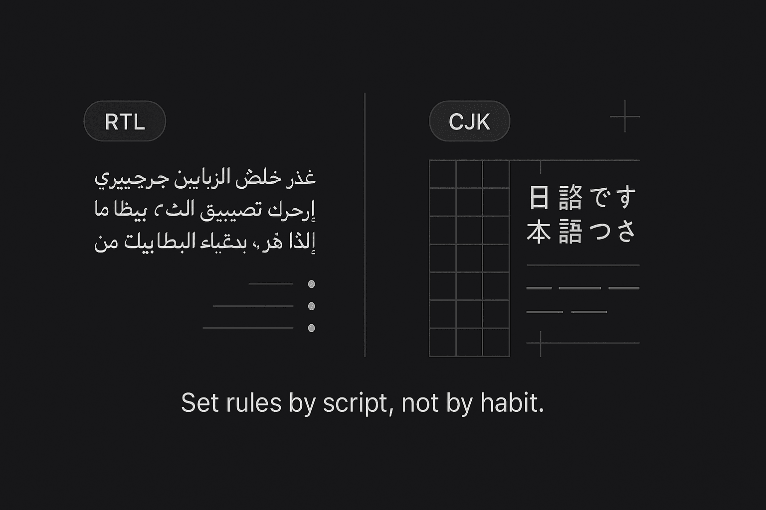
1) RTL basics (Arabic/Hebrew)
Direction & bi-di
Set paragraph direction = Right-to-Left; keep numbers or Latin codes LTR using character-level direction.
Mirror punctuation automatically (parentheses, brackets) where the font supports it.
Digits & punctuation
Pick the right digits: Arabic-Indic vs Latin—follow client style.
Use real RTL punctuation and quote marks from the font (avoid ASCII stand-ins).
Justification & kashida
Avoid “letter spacing” for justification. Use Kashida (contextual elongation) sparingly; medium at most.
Keep word spacing conservative to prevent rivers.
Lists & bullets
Bullets/numbering must inherit RTL direction so numbers sit on the right side consistently.
InDesign tips (fast)
Composer: Adobe World-Ready Paragraph Composer
Paragraph Direction: RTL
Digits: Arabic, Hindi, or Default per brief
Kashida: None / Medium (test in long paragraphs)
Keep Option: Keep Lines Together for headings
2) CJK essentials (Chinese/Japanese/Korean)
No hyphenation
CJK uses ideographic breaks; turn off Western hyphenation.
Kinsoku & mojikumi
Enable Kinsoku Shori (line-break rules) to avoid starting/ending lines with forbidden punctuation.
Apply Mojikumi (spacing presets) for commas, periods, brackets, and emphasis dots.
Line length & grid
Target ~28–40 full-width characters per line for body text.
Use an em-based baseline grid so Latin and CJK sit cleanly together.
Vertical vs horizontal
Japanese can be tategaki (vertical) or yokogaki (horizontal). Confirm early; vertical layouts affect captions, tables, and callouts.
InDesign tips (fast)
Composer: Adobe Japanese/Chinese/Korean composer (per language)
Kinsoku: Strong set; turn on Hanging punctuation when appropriate
Use Proportional Metrics for Latin mixed in CJK; avoid fake bold/italic
3) Fonts & fallback strategy
Prefer pan-CJK families for consistency across CN/JP/KR (e.g., Source Han / Noto CJK).
For Arabic, pair Noto Naskh/Kufi or other professional families; ensure Arabic figures and contextual forms render correctly.
Avoid system fonts or faux styles; use real bold/italic weights.
Define a fallback chain (Primary → Secondary) to cover missing glyphs.
Confirm licensing for embedding in PDF/X and app distribution.
4) Mixed scripts without chaos
Keep numbers, URLs, product codes LTR inside RTL paragraphs using character direction.
For CJK + Latin, adjust baseline shift or proportional metrics so Latin doesn’t float.
Align tables to local reading direction; flip column order for RTL if the content requires it.
5) Export & handoff like a pro
PDF/X-4 (preferred) or PDF/X-1a for print; embed fonts.
Supply INDD + IDML (packaged) and linked assets.
For web, export SVG/PNG diagrams with outlined CJK/RTL text only when necessary—keep live text wherever possible.
6) A two-minute preflight checklist
Paragraph directions set? RTL where needed; Latin runs protected.
Correct digits (Arabic-Indic vs Latin) per style?
CJK hyphenation OFF; Kinsoku/Mojikumi ON?
Line length sane (CJK 28–40 chars); grid aligned?
Punctuation mirrored (RTL) and not stranded (CJK)?
No faux styles; fonts licensed and embedded?
Overset text cleared after translation expansion?
Tags
More Articles
Explore more from our blog
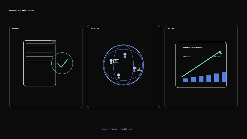
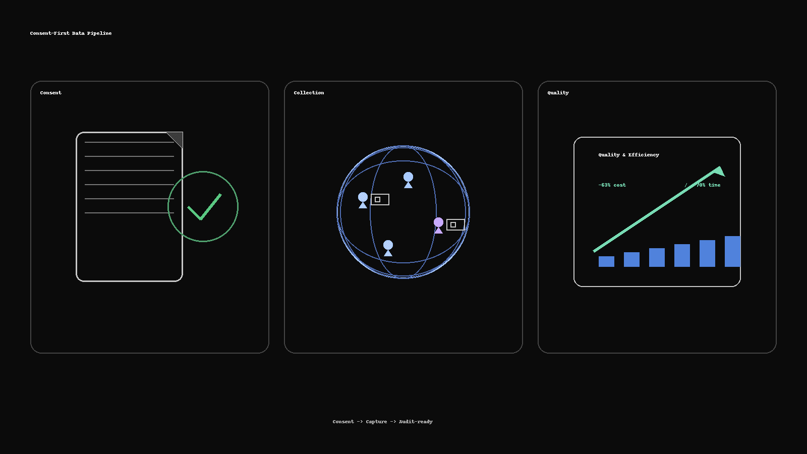
Consent-First Data Collection: How We Delivered 300+ People-Image Sets 63% Cheaper
How Saytica built an audit-ready, real-person image dataset: 300+ participants across six demographic groups, delivered 63% cheaper and 70% faster—using consent kits, vendor routing, QC scorecards, and dedupe pipelines.

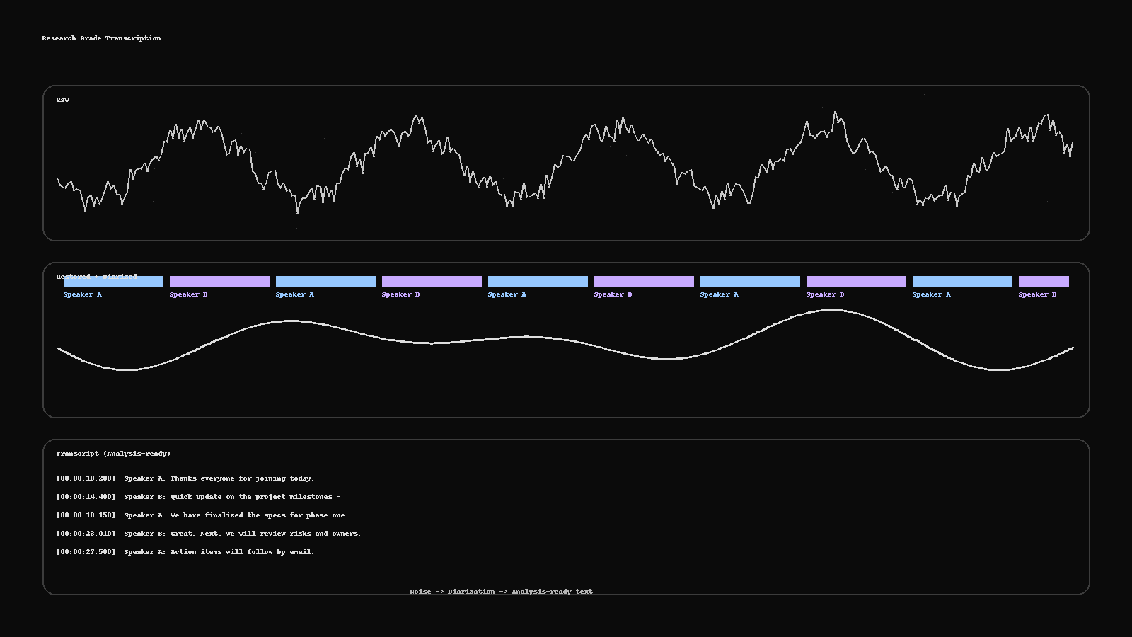
Research-Grade Transcription: From Noisy Audio to Analysis-Ready Text
Turn messy recordings into clean, analysis-ready text. This guide shows a practical pipeline—restoration, diarization, human QC, PII redaction, and deliverables (RTTM, ELAN, TextGrid, SRT)—plus a two-minute checklist to run before publishing.
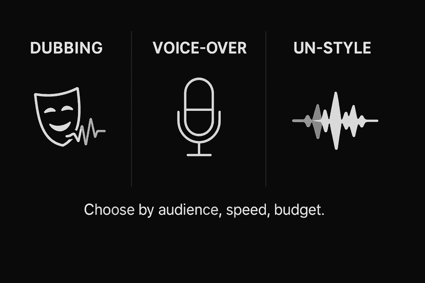
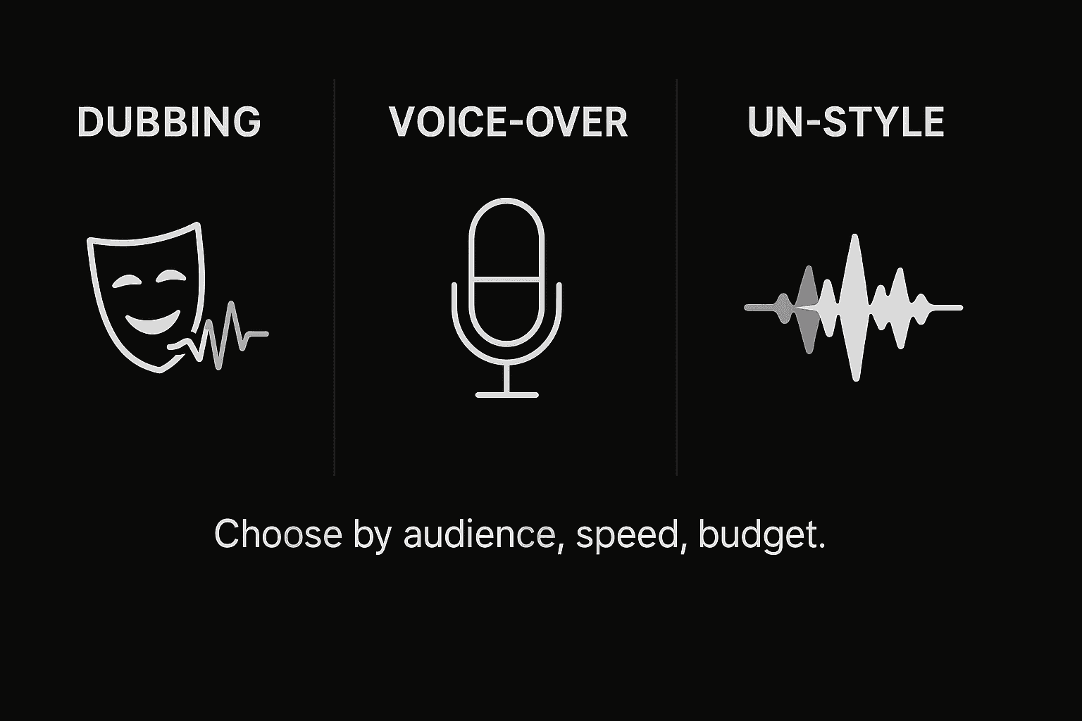
Dubbing vs Voice-Over vs UN-Style: Pick the Right Voice for Your Market
Not sure whether to dub, use voice-over, or go UN-style? Here’s a fast framework with cost/time differences, when to use each, a casting brief template, and the delivery specs your studio will ask for.
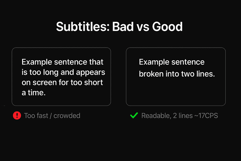
Subtitles That Don’t Feel “Machine”: Read-Speed, SDH & Platform Specs
Why some captions feel robotic—and how to fix them fast. A practical guide to read-speed, SDH vs. standard subtitles, on-screen text, and a simple QC checklist you can run before publish.

The 2025 Localization Playbook: TEP vs MTPE—When to Use Which
Choose the right workflow in 2025. This playbook shows when to use TEP (human translation + edit + proof) and when MTPE makes sense—plus a decision matrix, quality bars, a pilot plan, and risk controls.